Illustration
Design
About
Menu
I am an illustrator and designer inspired by bright colors and gritty textures.
Illustration
Design
About
prev
/
next
Back to Illustration
0
Target Black History Month
0
Be A Voter (ACLU-MN)
0
Children's Theatre Curtain Call Ball
0
Bubble Gum Girl
0
Curiosity Studio
0
Impromptu Gathering
0
Lacek Group
0
Up North
0
Avant Garde Bouquet
0
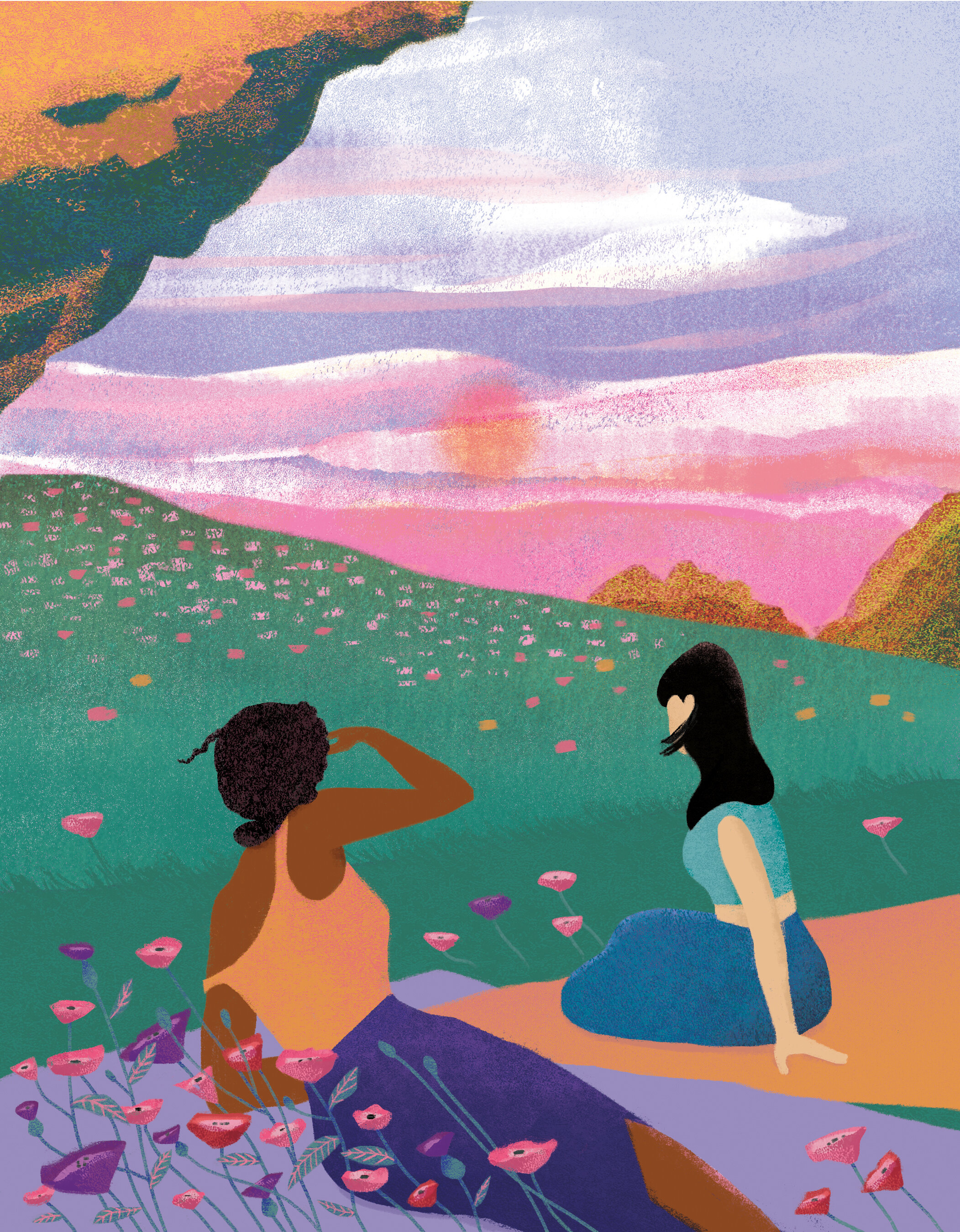
Sunset Picnic